improved
fixed
Orbit App
Reports improvement!
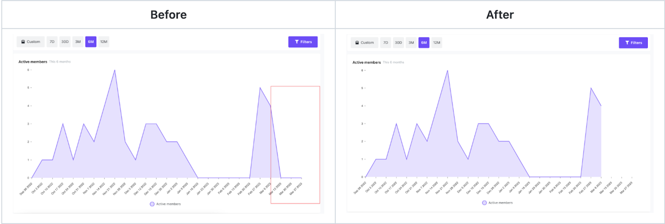
Line charts in Orbit have been improved! Before, for future weeks along the x-axis, we'd show values as 0 which could potentially seem a bit alarming (à la "Why did my community activity completely drop off here??")
Now, when viewing your line charts for 3+ month views (and grouped by Week), you'll clearly see where the weeks up to now end and the future weeks begin.